Serif vs Sans Serif
Small lines in the ends of the characters, popular sans serif fonts include Helvetica, Avant Garde, Arial, and Geneva. Serif fonts include Times Roman, Courier, New Century Schoolbook, and Palatino. A lot of Serif typefaces that you'll see will look a lot more traditional or conservative. People tend to use Serif typefaces for something quite serious. This is because of their traditional and conservative look and feel.
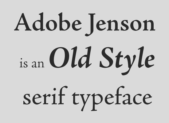
 Old style: Including Adobe Jenson, Centaur, Goudy old style, and many more. It is what text looks like in the 1400s (very old looking ).
Small lines in the ends of the characters, popular sans serif fonts include Helvetica, Avant Garde, Arial, and Geneva. Serif fonts include Times Roman, Courier, New Century Schoolbook, and Palatino. A lot of Serif typefaces that you'll see will look a lot more traditional or conservative. People tend to use Serif typefaces for something quite serious. This is because of their traditional and conservative look and feel.
Old style: Including Adobe Jenson, Centaur, Goudy old style, and many more. It is what text looks like in the 1400s (very old looking ). 
Transitional: This is a bit more modern-looking, This include Times New Roman, Baskerville, Georgia.
Modern: Classy-looking and modern-looking, this include Didot, which is the typeface used for the title of Vogue magazine.

Slab-Serif: They are known as thick Serifs examples of slab-serif typefaces include, American typewriter, archer.
One of the first determinations to be made when selecting a typeface for text is serif or sans? This decision should be based on several key points regarding the project at hand. Once made, your typeface search will be narrowed down considerably. Although serifs are considered to be decorative, their appearance may well serve a higher purpose.So whichever style you choose, take note of the particular characteristics and overall legibility of the design, including specific weights and roman vs. italic.For projects involving lengthy text, such as books, newspapers, and most magazines, serif typefaces are the most commonly used typestyle. Their prevalence stems from a combination of historical precedent and perceived readability.
Modern: Classy-looking and modern-looking, this include Didot, which is the typeface used for the title of Vogue magazine.
Slab-Serif: They are known as thick Serifs examples of slab-serif typefaces include, American typewriter, archer.
One of the first determinations to be made when selecting a typeface for text is serif or sans? This decision should be based on several key points regarding the project at hand. Once made, your typeface search will be narrowed down considerably. Although serifs are considered to be decorative, their appearance may well serve a higher purpose.So whichever style you choose, take note of the particular characteristics and overall legibility of the design, including specific weights and roman vs. italic.For projects involving lengthy text, such as books, newspapers, and most magazines, serif typefaces are the most commonly used typestyle. Their prevalence stems from a combination of historical precedent and perceived readability.
Comments
Post a Comment